Plotting
R for Data Science
Basel R Bootcamp

Basel R Bootcamp
from today.com
Overview
In this practical you’ll practice plotting data with the amazing ggplot2 package. By the end of this practical you will know how to:
- Build a plot step-by-step.
- Use multiple geoms.
- Work with facets.
- Adjust colors and add labels.
- Create image files.
Tasks
A - Setup
- Open your
BaselRBootcampR project. It should already have the folders1_Dataand2_Code. Make sure that the data files listed in theDatasetssection above are in your1_Datafolder.
# Done!- Open a new R script. At the top of the script, using comments, write your name and the date and “Plotting Practical”.
## NAME
## DATE
## Plotting Practical
Save the file under the name
plotting_practical.Rin the2_Codefolder.Using
library()load thetidyverseandggthemespackages for this practical listed in the Functions section above. If you don’t have them installed, you’ll need to install them, see the Functions tab above for installation instructions.
# Load packages
library(tidyverse)
library(ggthemes)
library(tidyverse)
library(ggthemes)- For this practical, we’ll use the
mcdonalds.csvdata set, which contains nutrition information about items from McDonalds. Usingread_csv(), load the data into R and store it as a new object calledmcdonalds.
# Load mcdonalds.csv as a new object called mcdonalds
XX <- read_csv("XX/XX")
mcdonalds <- read_csv("1_Data/mcdonalds.csv")- Using
print(),summary(),head(), andView(), explore the data to make sure it was loaded correctly.
mcdonalds# A tibble: 260 x 14
Category Item ServingSize Calories CaloriesfromFat TotalFat
<chr> <chr> <chr> <dbl> <dbl> <dbl>
1 Breakfa… Egg … 4.8 oz (13… 300 120 13
2 Breakfa… Egg … 4.8 oz (13… 250 70 8
3 Breakfa… Saus… 3.9 oz (11… 370 200 23
4 Breakfa… Saus… 5.7 oz (16… 450 250 28
5 Breakfa… Saus… 5.7 oz (16… 400 210 23
6 Breakfa… Stea… 6.5 oz (18… 430 210 23
7 Breakfa… Baco… 5.3 oz (15… 460 230 26
8 Breakfa… Baco… 5.8 oz (16… 520 270 30
9 Breakfa… Baco… 5.4 oz (15… 410 180 20
10 Breakfa… Baco… 5.9 oz (16… 470 220 25
# … with 250 more rows, and 8 more variables: SaturatedFat <dbl>,
# TransFat <dbl>, Cholesterol <dbl>, Sodium <dbl>, Carbohydrates <dbl>,
# DietaryFiber <dbl>, Sugars <dbl>, Protein <dbl>summary(mcdonalds) Category Item ServingSize Calories
Length:260 Length:260 Length:260 Min. : 0
Class :character Class :character Class :character 1st Qu.: 210
Mode :character Mode :character Mode :character Median : 340
Mean : 368
3rd Qu.: 500
Max. :1880
CaloriesfromFat TotalFat SaturatedFat TransFat
Min. : 0 Min. : 0.0 Min. : 0.00 Min. :0.000
1st Qu.: 20 1st Qu.: 2.4 1st Qu.: 1.00 1st Qu.:0.000
Median : 100 Median : 11.0 Median : 5.00 Median :0.000
Mean : 127 Mean : 14.2 Mean : 6.01 Mean :0.204
3rd Qu.: 200 3rd Qu.: 22.2 3rd Qu.:10.00 3rd Qu.:0.000
Max. :1060 Max. :118.0 Max. :20.00 Max. :2.500
Cholesterol Sodium Carbohydrates DietaryFiber
Min. : 0 Min. : 0 Min. : 0.0 Min. :0.00
1st Qu.: 5 1st Qu.: 108 1st Qu.: 30.0 1st Qu.:0.00
Median : 35 Median : 190 Median : 44.0 Median :1.00
Mean : 55 Mean : 496 Mean : 47.3 Mean :1.63
3rd Qu.: 65 3rd Qu.: 865 3rd Qu.: 60.0 3rd Qu.:3.00
Max. :575 Max. :3600 Max. :141.0 Max. :7.00
Sugars Protein
Min. : 0.0 Min. : 0.0
1st Qu.: 5.8 1st Qu.: 4.0
Median : 17.5 Median :12.0
Mean : 29.4 Mean :13.3
3rd Qu.: 48.0 3rd Qu.:19.0
Max. :128.0 Max. :87.0 head(mcdonalds)# A tibble: 6 x 14
Category Item ServingSize Calories CaloriesfromFat TotalFat SaturatedFat
<chr> <chr> <chr> <dbl> <dbl> <dbl> <dbl>
1 Breakfa… Egg … 4.8 oz (13… 300 120 13 5
2 Breakfa… Egg … 4.8 oz (13… 250 70 8 3
3 Breakfa… Saus… 3.9 oz (11… 370 200 23 8
4 Breakfa… Saus… 5.7 oz (16… 450 250 28 10
5 Breakfa… Saus… 5.7 oz (16… 400 210 23 8
6 Breakfa… Stea… 6.5 oz (18… 430 210 23 9
# … with 7 more variables: TransFat <dbl>, Cholesterol <dbl>,
# Sodium <dbl>, Carbohydrates <dbl>, DietaryFiber <dbl>, Sugars <dbl>,
# Protein <dbl># View(kc_house)B - Building a plot step-by-step
In this section, you’ll build the following plot step by step.
- Using
ggplot(), create the following blank plot using thedataandmappingarguments (but no geom). UseCaloriesfor the x aesthetic andSaturatedFatfor the y aesthetic
ggplot(data = mcdonalds,
       mapping = aes(x = XX, y = XX))
ggplot(mcdonalds, aes(x = Calories, y = SaturatedFat))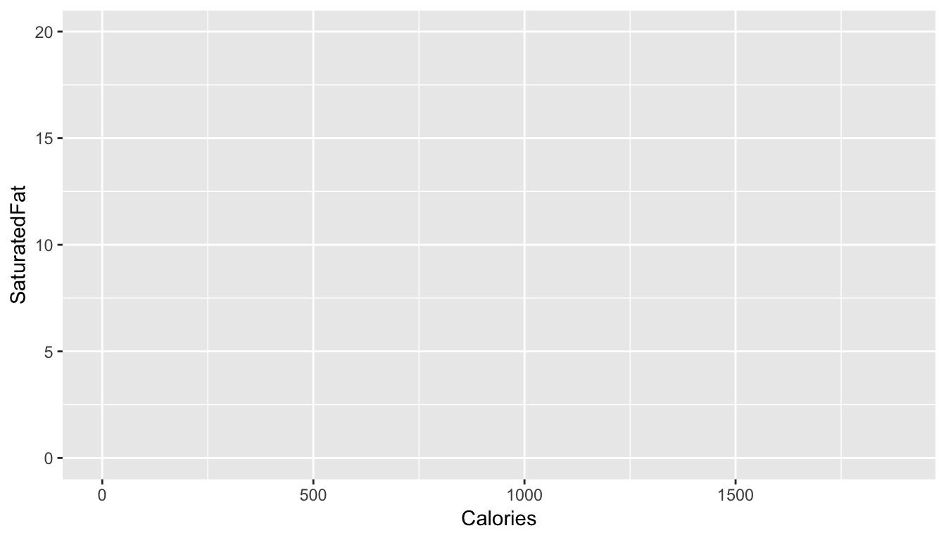
- Using
geom_point(), add points to the plot
ggplot(data = mcdonalds,
       mapping = aes(x = XX, y = XX)) +
  geom_point()
ggplot(mcdonalds, aes(x = Calories, y = SaturatedFat)) +
geom_point()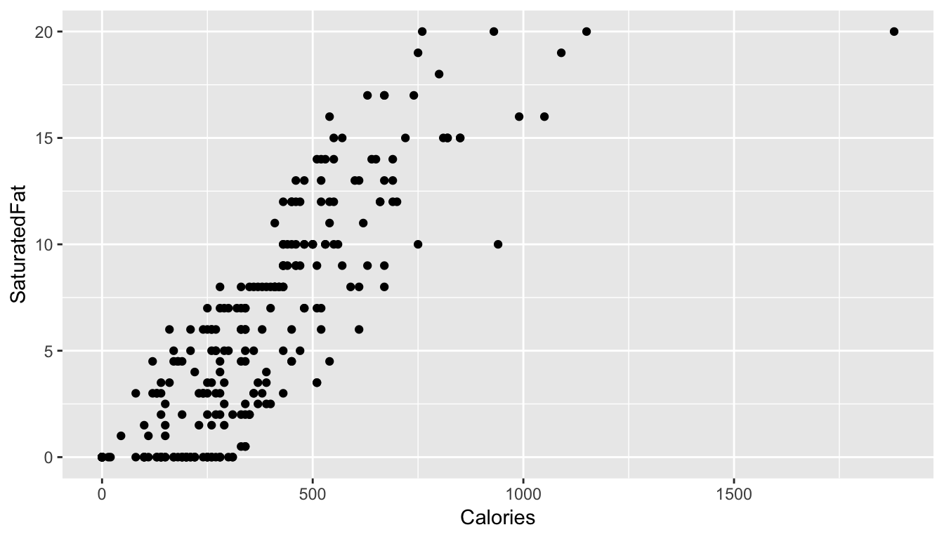
- Using the
coloraesthetic mapping, color the points by theirCategory.
ggplot(mcdonalds, aes(x = XX, y = XX, col = XX)) +
  geom_point()
ggplot(mcdonalds, aes(x = Calories, y = SaturatedFat, col = Category)) +
geom_point()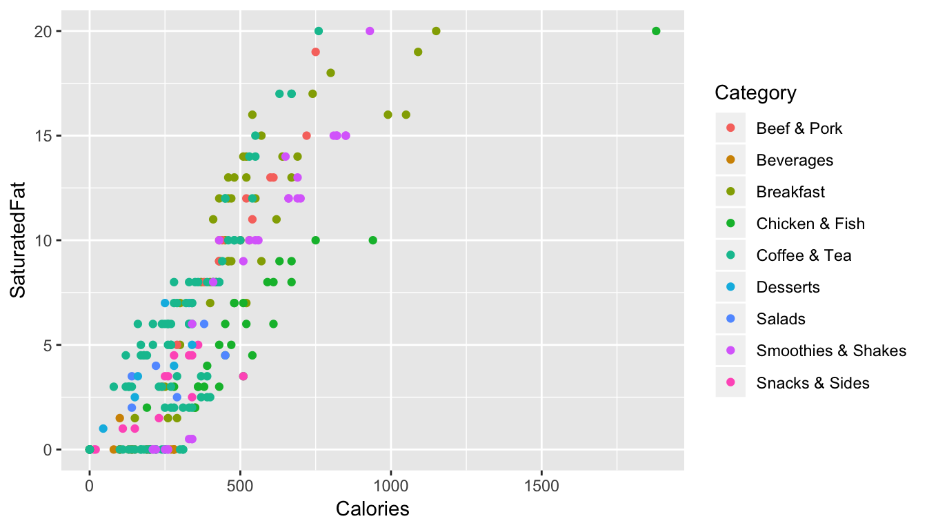
- Add a smoothed average line using
geom_smooth().
ggplot(mcdonalds, aes(x = XX, y = XX, col = XX)) +
  geom_point() +
  geom_smooth()
ggplot(mcdonalds, aes(x = Calories, y = SaturatedFat, col = Category)) +
geom_point() +
geom_smooth()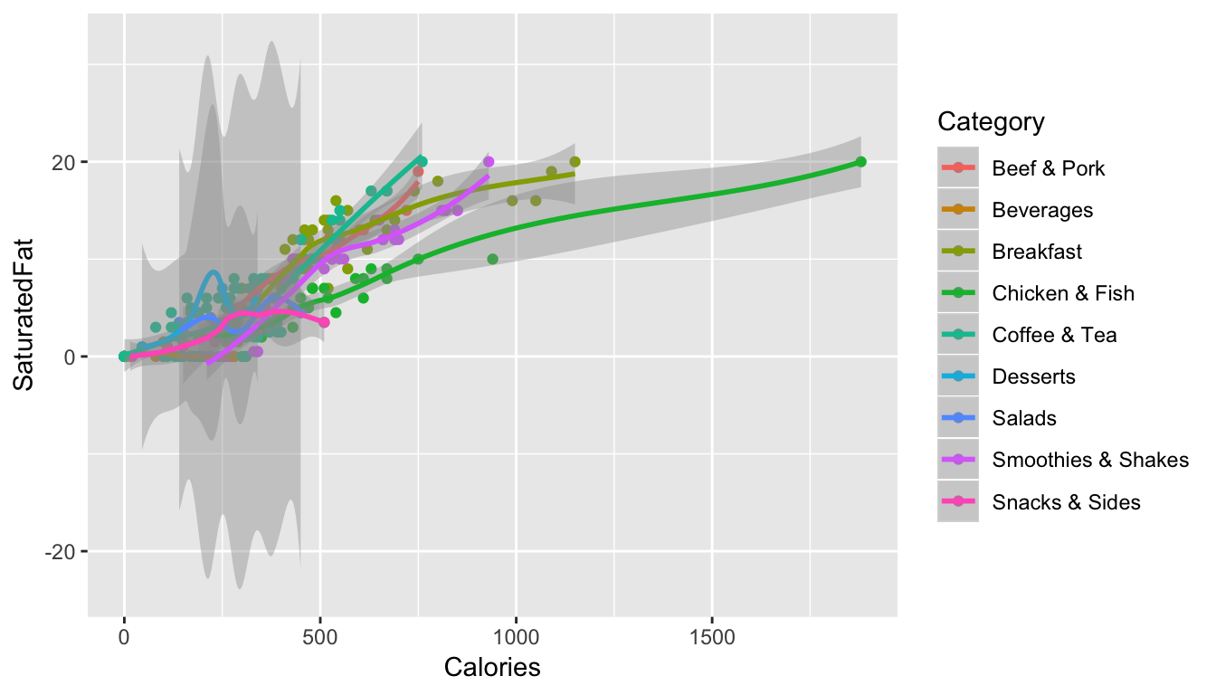
- Oops! Did you get several smoothed lines instead of just one? Fix this by specifying that the line should have one color:
"black". When you do, you should then only see one line.
ggplot(mcdonalds, aes(x = XX, y = XX, col = XX)) +
  geom_point() +
  geom_smooth(col = "XX")
ggplot(mcdonalds, aes(x = Calories, y = SaturatedFat, col = Category)) +
geom_point() +
geom_smooth(col = "black")
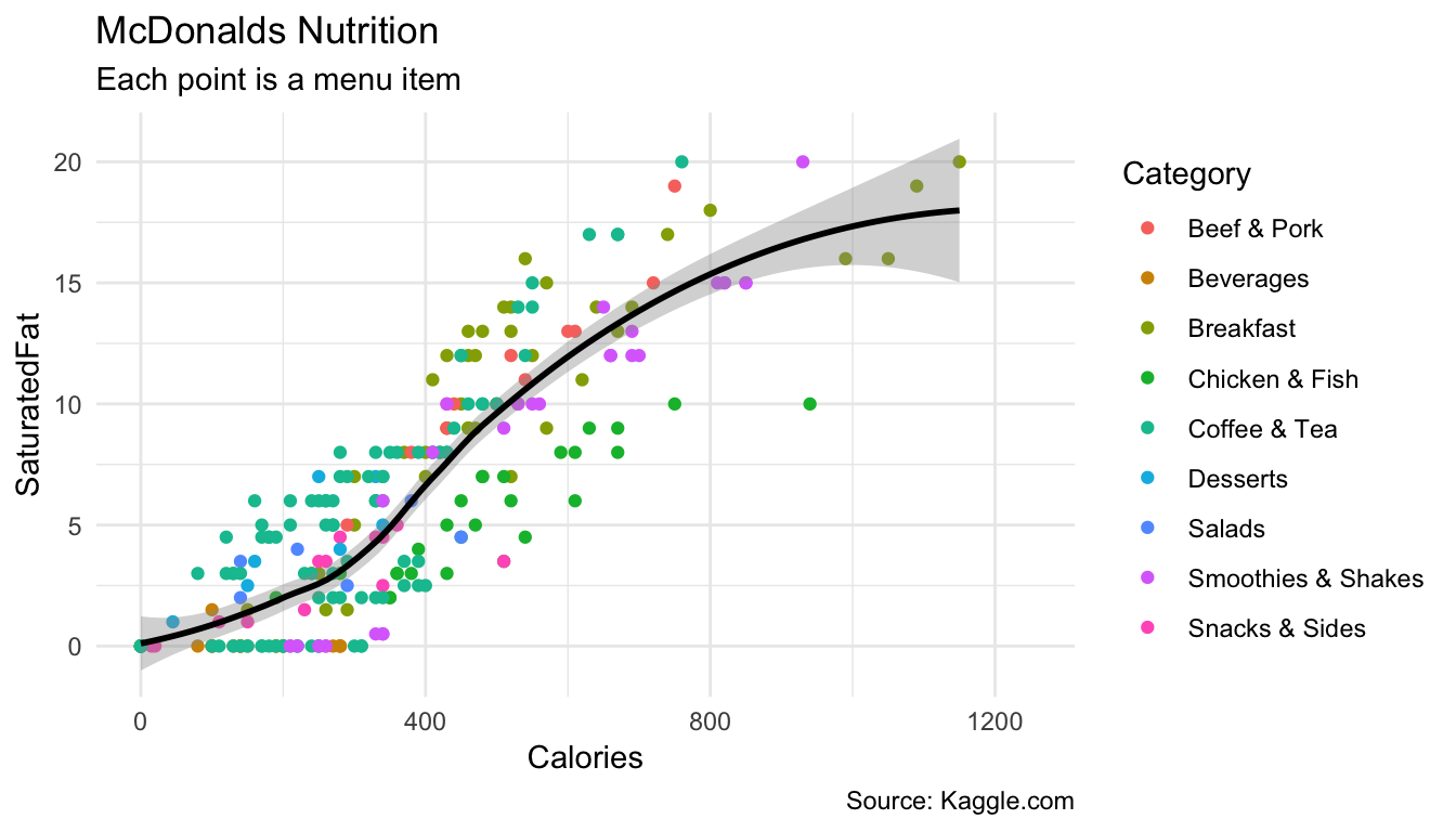
- Add appropriate labels using the
labs()function.
ggplot(mcdonalds, aes(x = XX, y = XX, col = XX)) +
  geom_point() +
  geom_smooth(col = "XX") +
  labs(title = "XX",
       subtitle = "XX",
       caption = "XX")
ggplot(mcdonalds, aes(x = Calories, y = SaturatedFat, col = Category)) +
geom_point() +
geom_smooth(col = "black") +
labs(title = "McDonalds Nutrition",
subtitle = "Each point is a menu item",
caption = "Source: Kaggle.com")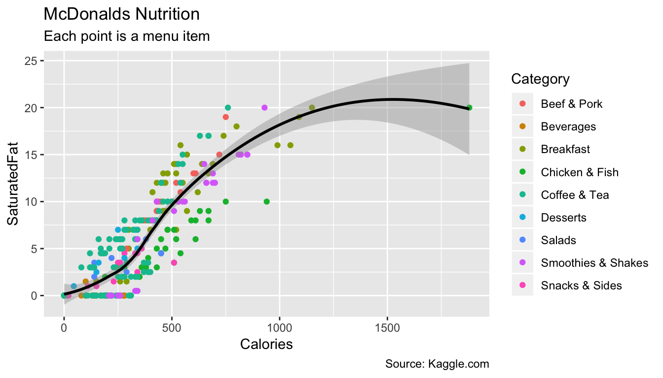
- Set the limits of the x-axis to
0and1250usingxlim().
ggplot(mcdonalds, aes(x = XX, y = XX, col = XX)) +
  geom_point() +
  geom_smooth(col = "XX") +
  labs(title = "XX",
       subtitle = "XX",
       caption = "XX") +
  xlim(XX, XX)
ggplot(mcdonalds, aes(x = Calories, y = SaturatedFat, col = Category)) +
geom_point() +
geom_smooth(col = "black") +
labs(title = "McDonalds Nutrition",
subtitle = "Each point is a menu item",
caption = "Source: Kaggle.com") +
xlim(0, 1250)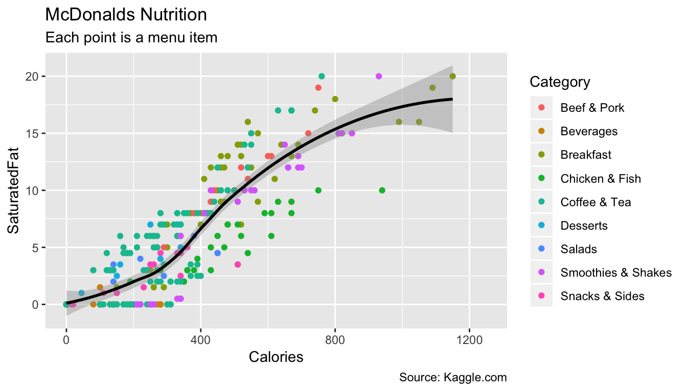
- Finally, set the plotting theme to
theme_minimal(). You should now have the final plot!
ggplot(mcdonalds, aes(x = XX, y = XX, col = XX)) +
  geom_point() +
  geom_smooth(col = "XX") +
  labs(title = "XX",
       subtitle = "XX",
       caption = "XX")+
  xlim(XX, XX) +
  theme_minimal()
ggplot(mcdonalds, aes(x = Calories, y = SaturatedFat, col = Category)) +
geom_point() +
geom_smooth(col = "black") +
labs(title = "McDonalds Nutrition",
subtitle = "Each point is a menu item",
caption = "Source: Kaggle.com") +
xlim(0, 1250) +
theme_minimal()
C - Adding multiple geoms
- Create the following plot showing the relationship between menu category and calories
ggplot(data = mcdonalds, aes(x = XX, y = XX, fill = XX)) +
  geom_violin() +
  guides(fill = FALSE) +
  labs(title = "XX",
       subtitle = "XX")
ggplot(data = mcdonalds, aes(x = Category, y = Calories, fill = Category)) +
geom_violin() +
guides(fill = FALSE) +
labs(title = "McDonalds",
subtitle = "Calorie distribution by menu category")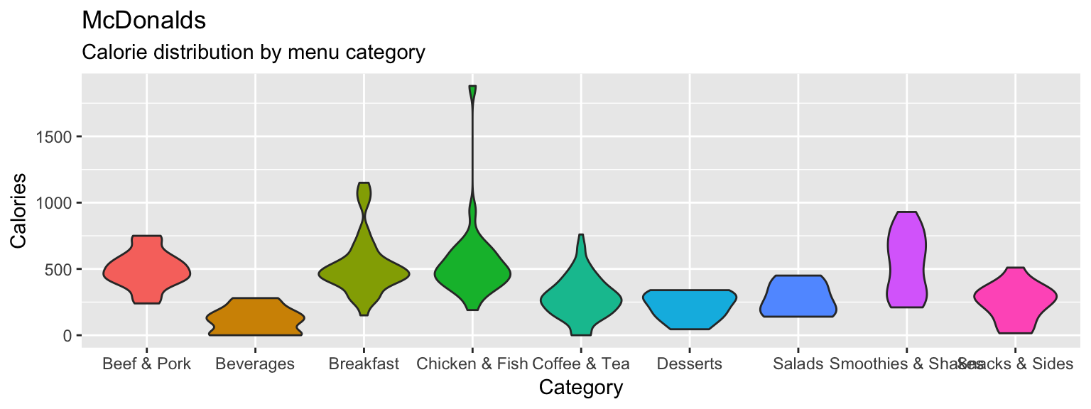
- Include the additional argument
+ stat_summary(fun.y = "mean", geom = "point", col = "white", size = 4)to include points showing the mean of each distribution
ggplot(data = mcdonalds, aes(x = Category, y = Calories, fill = Category)) +
  geom_violin() +
  guides(fill = FALSE) +
  stat_summary(fun.y = "mean", geom = "point", col = "white", size = 4) +
  labs(title = "McDonalds",
       subtitle = "Calorie distribution by menu category")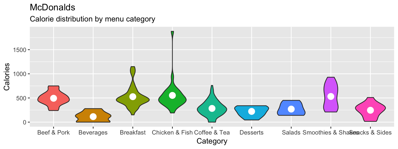
- Now add
+ geom_jitter(width = .1, alpha = .5)to your plot, what do you see?
ggplot(data = mcdonalds, aes(x = Category, y = Calories, fill = Category)) +
  geom_violin() +
  geom_jitter(width = .1, alpha = .5) +
  guides(fill = FALSE) +
  stat_summary(fun.y = "mean", geom = "point", col = "white", size = 4) +
  labs(title = "McDonalds",
       subtitle = "Calorie distribution by menu category")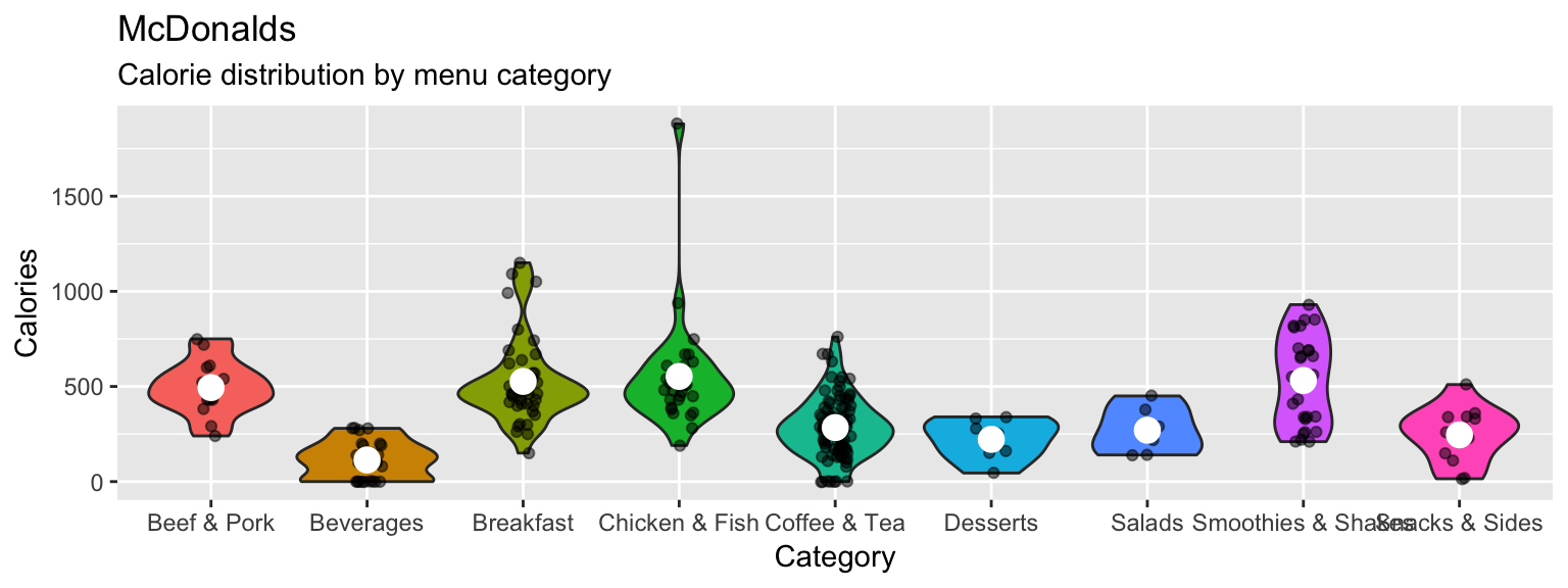
- Play around with your plotting arguments to see how the results change! Each time you make a change, run the plot again to see your new output!
- Change the summary function in
stat_summary()from"mean"to"median". - Change the size of the points in
stat_summary()to something much bigger (or smaller). - Change the
widthargument ingeom_jitter()towidth = 0. - Instead of using
geom_violin(), trygeom_boxplot(). - Remove the
fill = Categoryaesthetic entirely.
ggplot(data = mcdonalds, aes(x = Category, y = Calories)) +
  geom_boxplot() +
  geom_jitter(width = 0, alpha = .5) +
  guides(fill = FALSE) +
  stat_summary(fun.y = "median", geom = "point", col = "white", size = 10) +
  labs(title = "McDonalds",
       subtitle = "Calorie distribution by menu category")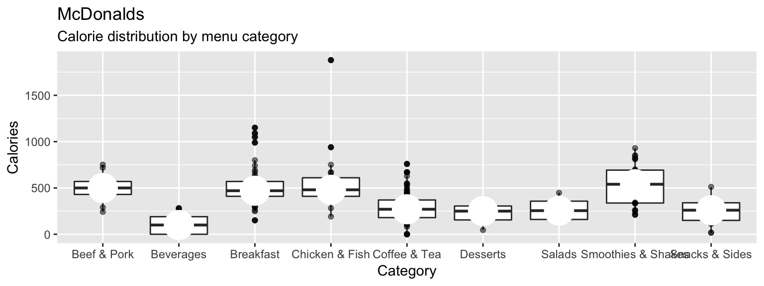
D - Using facets
- Create the following plot showing the relationship between
SodiumandCalories.
ggplot(XX, aes(x = XX, y = XX)) +
  geom_point(alpha = .2) +
  facet_wrap(~ XX) +
  labs(title = "XX",
       subtitle = "XX") +
  theme_minimal()
ggplot(mcdonalds, aes(x = Sodium, y = Calories)) +
geom_point(alpha = .2) +
facet_wrap(~Category) +
labs(title = "McDonales",
subtitle = "Sodium vs. Calories") +
theme_minimal()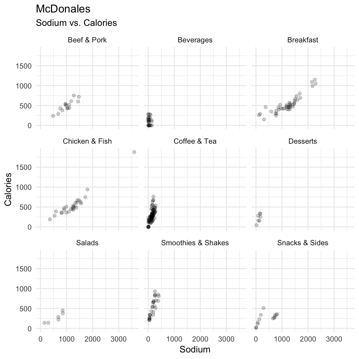
- Try the following ways to customise your plot:
- Color the points by
Category. - Add a smoothed line to each plot with
geom_smooth().
ggplot(mcdonalds, aes(x = Sodium, y = Calories, fill = Category)) +
  geom_point(alpha = .2) +
  facet_wrap(~Category) +
  labs(title = "McDonales",
       subtitle = "Sodium vs. Calories") +
  geom_smooth() +
  theme_minimal()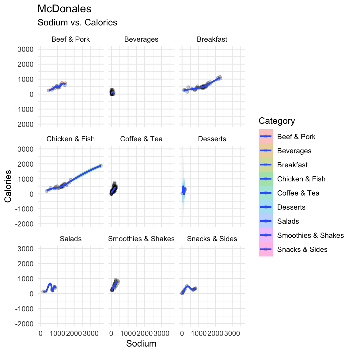
E - Adjusting colors
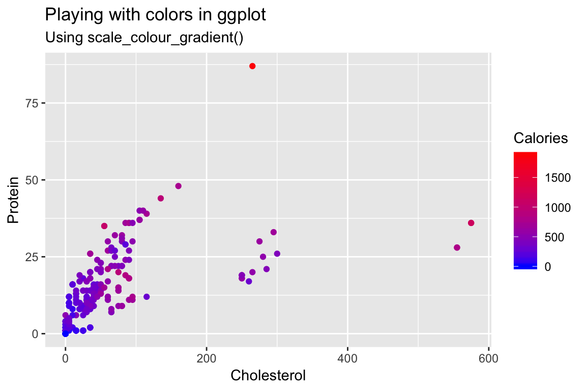
Create a scatterplot showing the relationship between
CholesterolandProtein.Color the points according to their Calories by specifying the
colaesthetic.Change the colors by including the additional argument
+ scale_colour_gradient(low = "blue", high = "red").Customize! Look at all of the named colors in R by running
colors(). Then, use two new colors in your plot.
ggplot(mcdonalds, aes(x = Cholesterol,
                      y = Protein,
                      col = Calories)) +
  geom_point() +
  scale_colour_gradient(low = "tomato2", high = "steelblue1") +
  labs(title = "Playing with colors in ggplot",
       subtitle = "Using scale_colour_gradient()")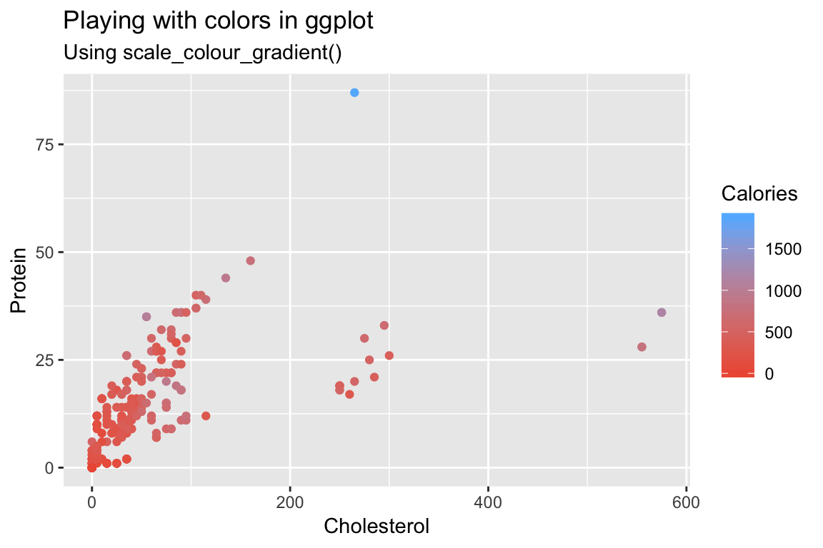
F - Summary statistics
- Create the following plot showing the mean number of calories for each menu category using the following template:
ggplot(XX, aes(x = XX, y = X)) +
  stat_summary(geom = "bar",
               fun.y = "mean") +
  labs(title = "XX",
       subtitle = "XX")
ggplot(mcdonalds, aes(x = Category, y = Calories)) +
stat_summary(geom = "bar",
fun.y = "mean") +
labs(title = "Calories by McDonalds menu category",
subtitle = "Bars represent means")
ggplot(mcdonalds, aes(x = Category, y = Calories)) +
  stat_summary(geom = "bar",
               fun.y = "mean") +
  labs(title = "Calories by McDonalds menu category",
       subtitle = "Bars represent means")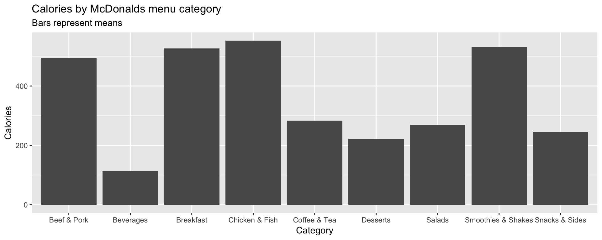
- Customize your plot!
- Instead of showing the
"mean", show the"median". - Give each bar a different color.
- Add overlapping points showing the individual items using
geom_point(),geom_count()orgeom_jitter().
ggplot(mcdonalds, aes(x = Category, y = Calories, col = Category)) +
  stat_summary(geom = "bar",
               fun.y = "median") +
  geom_jitter() +
  labs(title = "Calories by McDonalds menu category",
       subtitle = "Bars represent means")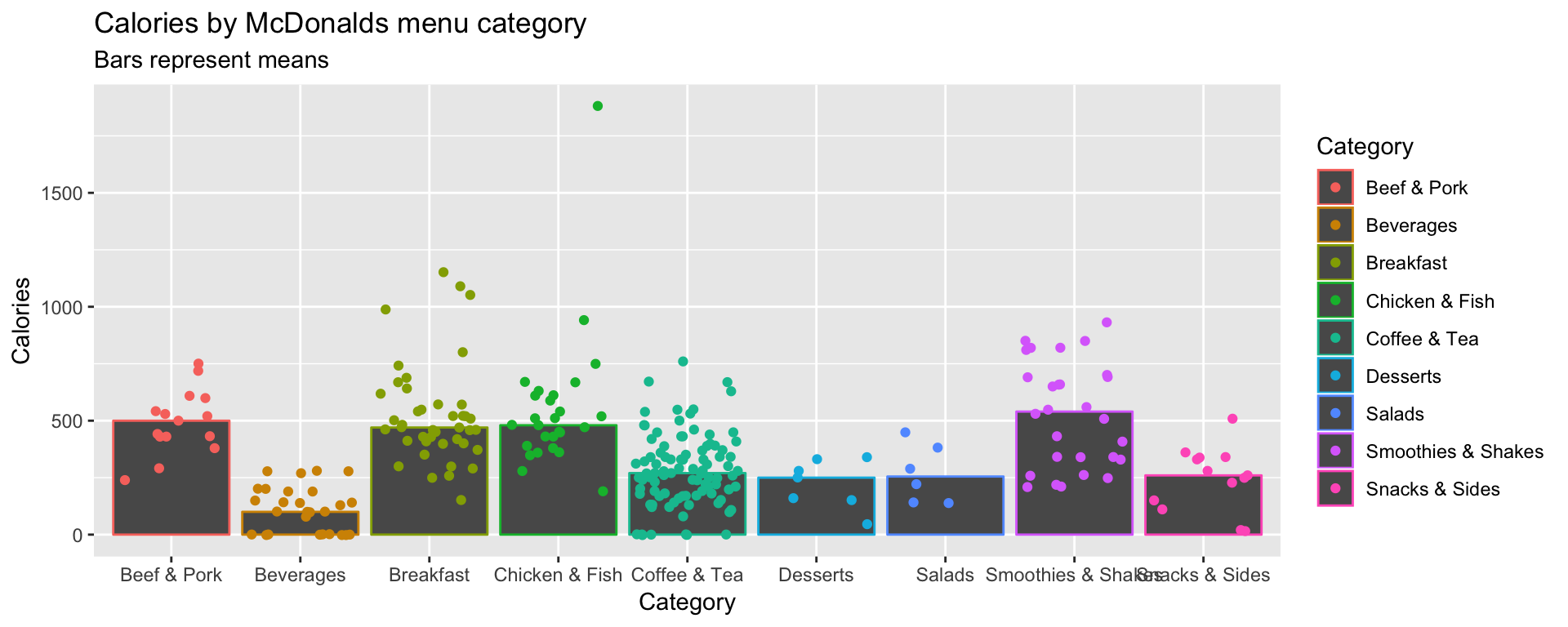
G - Saving plots
- It’s time to save your favorite plot to an image file! Pick your favorite plot you’ve created so far. Then, assign the plot to a new object called
mcdonalds_ggusingmcdonalds_gg <- ggplot(...)
mcdonalds_gg <- ggplot(...) + ... # Include your plotting code heremcdonalds_gg <- ggplot(mcdonalds, aes(x = Category, y = Calories, col = Category)) +
stat_summary(geom = "bar",
fun.y = "median") +
geom_jitter() +
labs(title = "Calories by McDonalds menu category",
subtitle = "Bars represent means")- Evaluate your
mcdonalds_ggobject to see that it does indeed contain your plot.
mcdonalds_gg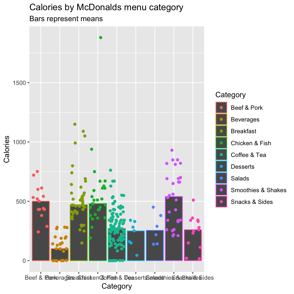
- Save your plot to a .pdf-file called
mcdonalds.pdfusingggsave(). When you finish, find your plot in3_Figuresand open it to see how it looks!
# Save mcdonalds_gg to a pdf file
ggsave(filename = "3_Figures/mcdonalds.pdf",
       device = "pdf",
       plot = mcdonalds_gg,
       width = 4,
       height = 4,
       units = "in")
# Save mcdonalds_gg to a pdf file
ggsave(filename = "3_Figures/mcdonalds.pdf",
device = "pdf",
plot = mcdonalds_gg,
width = 4,
height = 4,
units = "in")- Play around with the
widthandheightarguments to change the dimensions of the plot.
# Save mcdonalds_gg to a pdf file
ggsave(filename = "3_Figures/mcdonalds.pdf",
       device = "pdf",
       plot = mcdonalds_gg,
       width = 8,
       height = 3,
units = "in")- Customize your code to create a jpeg image called
mcdonalds.jpeg
# Save mcdonalds_gg to a pdf file
ggsave(filename = "3_Figures/mcdonalds.jpeg",
       device = "jpeg",
       plot = mcdonalds_gg,
       width = 4,
       height = 4,
       units = "in")
H - Adding labels
Let’s create the following plot with additional point labels using geom_text():
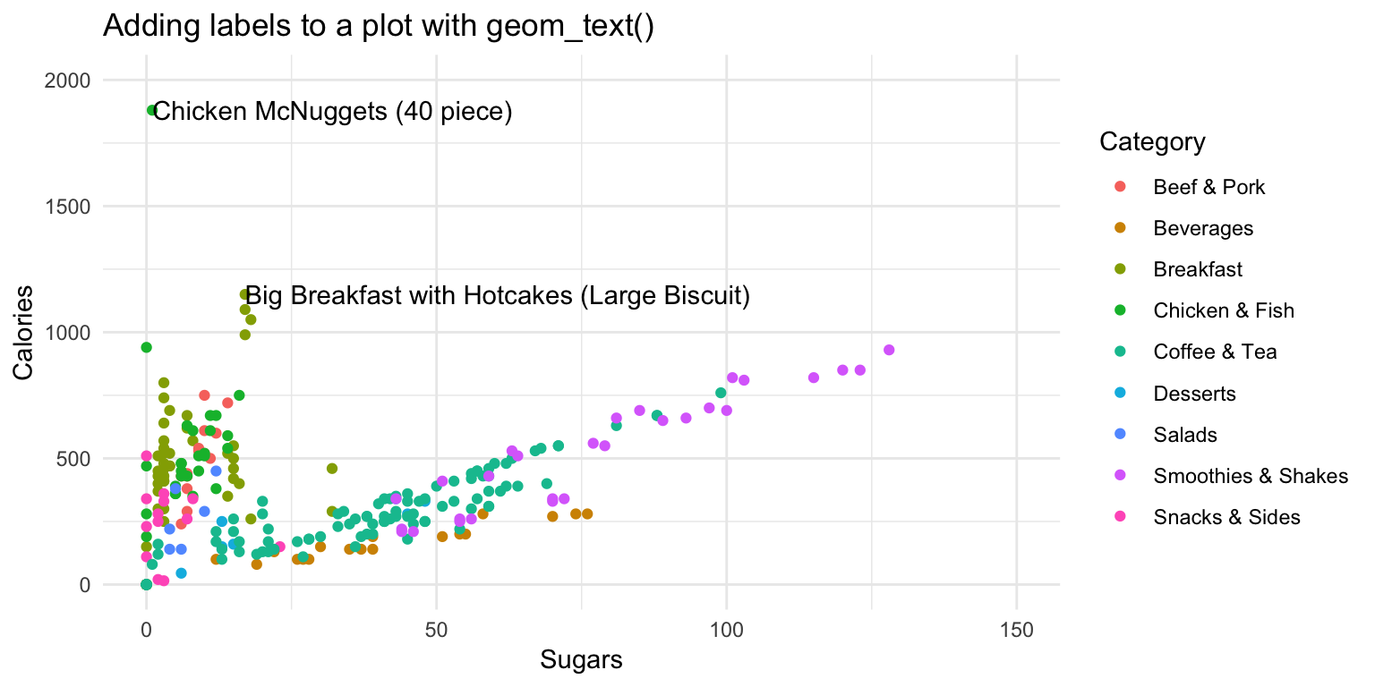
- Start with the following template
ggplot(mcdonalds, aes(x = XX,
                      y = XX,
                      col = XX)) +
  geom_point() +
  xlim(XX, XX) +
  ylim(XX, XX) +
  theme_minimal() +
  labs(title = "XX")
Try adding labels to the plot indicating which item each point represents by adding
+ geom_text().Where are the labels? Ah, we didn’t tell
ggplotwhich column in the data represents the item descriptions. Fix this by specifying thelabelaesthetic in your first call to theaes()function. That is, includelabel = Itemunderneath the linecol = XX. Now you should see lots of labels!Customize your
geom_text()by including the arguments:geom_text(col = "black", check_overlap = TRUE, hjust = "left").Using the
dataargument ingeom_text(), specify that the labels should only apply to items over 1100 calories (hint:geom_text(data = mcdonalds %>% filter(XX > XX)))
ggplot(mcdonalds, aes(x = Sugars,
                      y = Calories,
                      col = Category,
                      label = Item)) +
  geom_point() +
  geom_text(data = mcdonalds %>%
            filter(Calories > 1100),
            col = "black",
            check_overlap = TRUE,
            hjust = "left") +
  xlim(0, 150) +
  ylim(0, 2000) +
  theme_minimal() +
  labs(title = "Adding labels to a plot with geom_text()")
- Play around!
Specify that the size of the points should correspond to their Calories. Do this with the
sizeaesthetic.Instead of mapping
Categoryto thecoloraesthetic, try creating different facets for eachCategorywithfacet_wrap(~ Category).Try using a different plotting theme. For example, you can try
theme_excel()included in theggthemespackage.
X - Challenges
For these challenges, use the kc_house dataset. Load the data as kc_house
- Make this plot
- Hint: use
scale_color_gradient(low = "green", high = "red"))
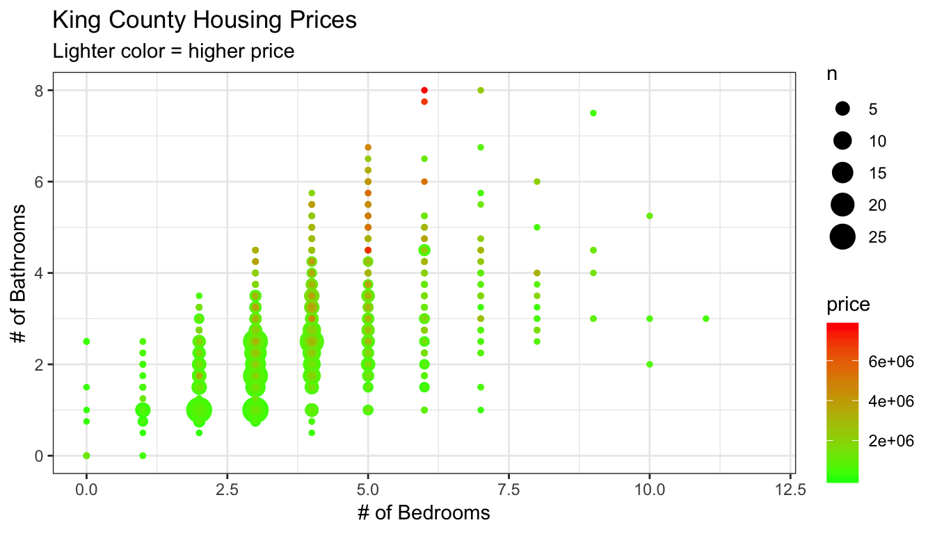
ggplot(data = kc_house,
       aes(x = bedrooms, y = bathrooms, col = price)) +
  geom_count() +
  labs(title = "King County Housing Prices",
       subtitle = "Lighter color = higher price",
       x = "# of Bedrooms",
       y = "# of Bathrooms") +
scale_color_gradient(low = "green", high = "red") +
  xlim(c(0, 12)) +
  theme_bw()
- Make this plot
- Hint: take the log of price with
log(price)

ggplot(data = kc_house,
       aes(x = yr_built, y = log(price))) +
  geom_count(alpha = .01) +
  geom_smooth() +
  stat_summary(size = .1) +
  guides(size = FALSE) +
  ylim(c(11, 15)) +
  labs(x = "Year Built",
       y = "Price (log-scale)",
       title = "Selling Seattle price of houses by year",
       subtitle = "Points indicate mean by year",
       caption = 'Line created by gam()') +
  theme_minimal()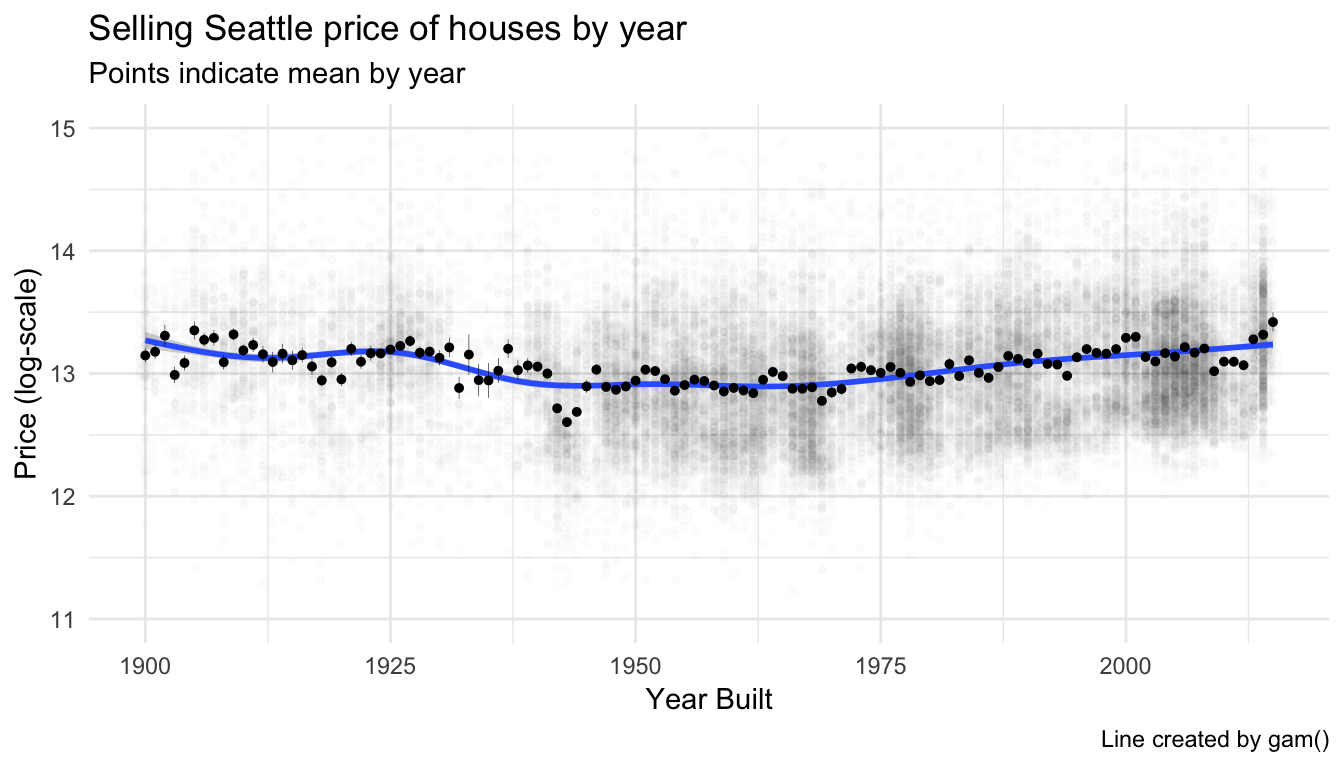
- Make this plot
- Hint: Start by creating an aggregated dataset with median home prices of the top 20 zipcodes. Then, use this dataset in ggplot!

agg <- kc_house %>%
  group_by(zipcode) %>%
  summarise(price_median = median(price)) %>%
  arrange(desc(price_median)) %>%
  mutate(zipcode = factor(zipcode, levels = zipcode, ordered = TRUE)) %>%
  slice(1:20) %>%
  mutate(rank = 1:20)

ggplot(agg,
       aes(x = rank, y = price_median, label = zipcode, size = price_median, alpha = price_median)) +
  geom_point(col = "skyblue") +
  geom_text(aes(x = rank, y = price_median), nudge_x = .7, nudge_y = 200000, angle = 45, size = 3, col = "black") +
  labs(y = "Median Home Price",
       x = "Rank",
       title = "Top 10 Most Expensive King County Zipcodes") +
  scale_x_continuous(breaks = 1:20) +
  ylim(c(0, 2300000)) +
    guides(size = FALSE, alpha = FALSE) +
  theme_minimal() +
  theme(panel.grid.major.x = element_blank(),
        panel.grid.minor.x = element_blank())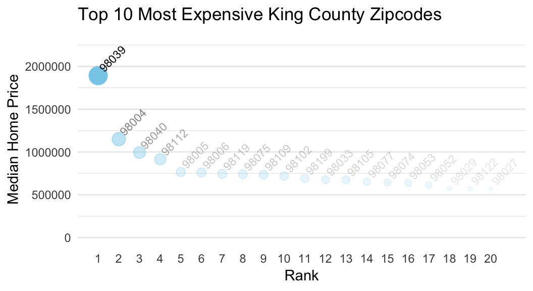
Y - Bonus: Interactive with plotly::ggplotly()
- With the
ggplotly()-function from theplotlypackage, you can turn anyggplotobject into an interactive plot like the one below! Run the following code to see it in action.
# Create a standard ggplot object
MyPlot <- ggplot(data = mcdonalds,
                 aes(x = Calories, y = TotalFat, col = Category)) +
  geom_point()


# Make it interactive with ggplotly()!
library(plotly)
ggplotly(MyPlot)
Play around with your plot! See what happens when you hover over the points with your mouse. You can even zoom in by dragging your mouse.
Try turning one of your favorite previous plots into an interactive
plotlyplot using theggplotly()function!
Examples
# -----------------------------------------------
# Examples of using ggplot2 on the mpg data
# ------------------------------------------------

library(tidyverse)         # Load tidyverse (which contains ggplot2!)

mpg # Look at the mpg data

# Just a blank space without any aesthetic mappings
ggplot(data = mpg)

# Now add a mapping where engine displacement (displ) and highway miles per gallon (hwy) are
# mapped to the x and y aesthetics
ggplot(data = mpg,
       mapping = aes(x = displ, y = hwy))   # Map displ to x-axis and hwy to y-axis

#  Add points with geom_point()
ggplot(data = mpg,
       mapping = aes(x = displ, y = hwy)) +
       geom_point()

#  Add points with geom_count()
ggplot(data = mpg,
       mapping = aes(x = displ, y = hwy)) +
       geom_count()

# Again, but with some additional arguments
# Also using a new theme temporarily

ggplot(data = mpg,
       mapping = aes(x = displ, y = hwy)) +
       geom_point(col = "red",                  # Red points
                  size = 3,                     # Larger size
                  alpha = .5,                   # Transparent points
                  position = "jitter") +        # Jitter the points
         scale_x_continuous(limits = c(1, 15)) +  # Axis limits
         scale_y_continuous(limits = c(0, 50)) +
  theme_minimal()


# Assign class to the color aesthetic and add labels with labs()

ggplot(data = mpg,
  mapping = aes(x = displ, y = hwy, col = class)) +  # Change color based on class column
  geom_point(size = 3, position = 'jitter') +
  labs(x = "Engine Displacement in Liters",
       y = "Highway miles per gallon",
       title = "MPG data",
       subtitle = "Cars with higher engine displacement tend to have lower highway mpg",
       caption = "Source: mpg data in ggplot2")


# Add a regression line for each class

ggplot(data = mpg,
       mapping = aes(x = displ, y = hwy, color = class)) +
  geom_point(size = 3, alpha = .9) +
  geom_smooth(method = "lm")

# Add a regression line for all classes

ggplot(data = mpg,
       mapping = aes(x = displ, y = hwy, color = class)) +
  geom_point(size = 3, alpha = .9) +
  geom_smooth(col = "blue", method = "lm")


# Facet by class
ggplot(data = mpg,
       mapping = aes(x = displ,
                     y = hwy,
                     color = factor(cyl))) +
  geom_point() +
  facet_wrap(~ class)


# Another fancier example

ggplot(data = mpg,
       mapping = aes(x = cty, y = hwy)) +
       geom_count(aes(color = manufacturer)) +     # Add count geom (see ?geom_count)
       geom_smooth() +                   # smoothed line without confidence interval
       geom_text(data = filter(mpg, cty > 25),
                 aes(x = cty,y = hwy,
                     label = rownames(filter(mpg, cty > 25))),
                     position = position_nudge(y = -1),
                                check_overlap = TRUE,
                     size = 5) +
       labs(x = "City miles per gallon",
            y = "Highway miles per gallon",
            title = "City and Highway miles per gallon",
            subtitle = "Numbers indicate cars with highway mpg > 25",
            caption = "Source: mpg data in ggplot2",
            color = "Manufacturer",
            size = "Counts")
Datasets
library(tidyverse)
library(plotly)
library(ggthemes)
mcdonalds <- read_csv("1_Data/mcdonalds.csv")
kc_house <- read_csv("1_Data/kc_house.csv")| File | Rows | Columns |
|---|---|---|
| mcdonalds.csv | 260 | 24 |
First 5 rows and columns of mcdonalds.csv
| Category | Item | ServingSize | Calories | CaloriesfromFat |
|---|---|---|---|---|
| Breakfast | Egg McMuffin | 4.8 oz (136 g) | 300 | 120 |
| Breakfast | Egg White Delight | 4.8 oz (135 g) | 250 | 70 |
| Breakfast | Sausage McMuffin | 3.9 oz (111 g) | 370 | 200 |
| Breakfast | Sausage McMuffin with Egg | 5.7 oz (161 g) | 450 | 250 |
| Breakfast | Sausage McMuffin with Egg Whites | 5.7 oz (161 g) | 400 | 210 |
Functions
Packages
| Package | Installation |
|---|---|
tidyverse |
install.packages("tidyverse") |
ggthemes |
install.packages("ggthemes") |
Resources
Documentation
The main
ggplot2webpage at http://ggplot2.tidyverse.org/ has great tutorials and examples.Check out Selva Prabhakaran’s website for a nice gallery of ggplot2 graphics http://r-statistics.co/Top50-Ggplot2-Visualizations-MasterList-R-Code.html
ggplot2is also great for making maps. For examples, check out Eric Anderson’s page at http://eriqande.github.io/rep-res-web/lectures/making-maps-with-R.html
Cheatsheets
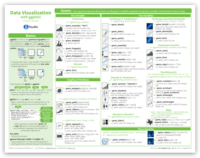
from R Studio